The best cabinet color combinations do more than make a kitchen look interesting. They shape the mood of the room, help define the layout, and make the entire space feel more intentional and layered from the moment you walk in.
Ideas to try
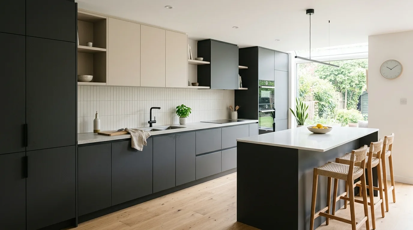
1. Use Two Tones to Define the Layout
Using two cabinet tones can help define different zones in the kitchen, such as an island versus the perimeter or upper cabinets versus lowers. This makes the room feel more intentional and visually structured.
When done well, the color difference is not just decorative. It becomes part of how the kitchen reads and functions.
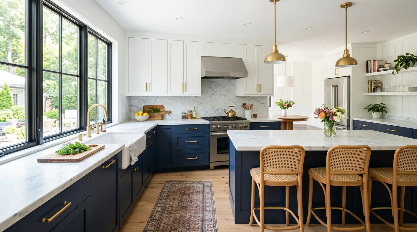
2. Pair Light Uppers With Dark Lowers
Light uppers and darker lowers are a classic combination because they keep the kitchen feeling open while still adding depth near the base. The eye naturally reads the room as lighter and taller.
This is one of the easiest two-tone strategies to live with over time. It feels balanced, practical, and visually smart.
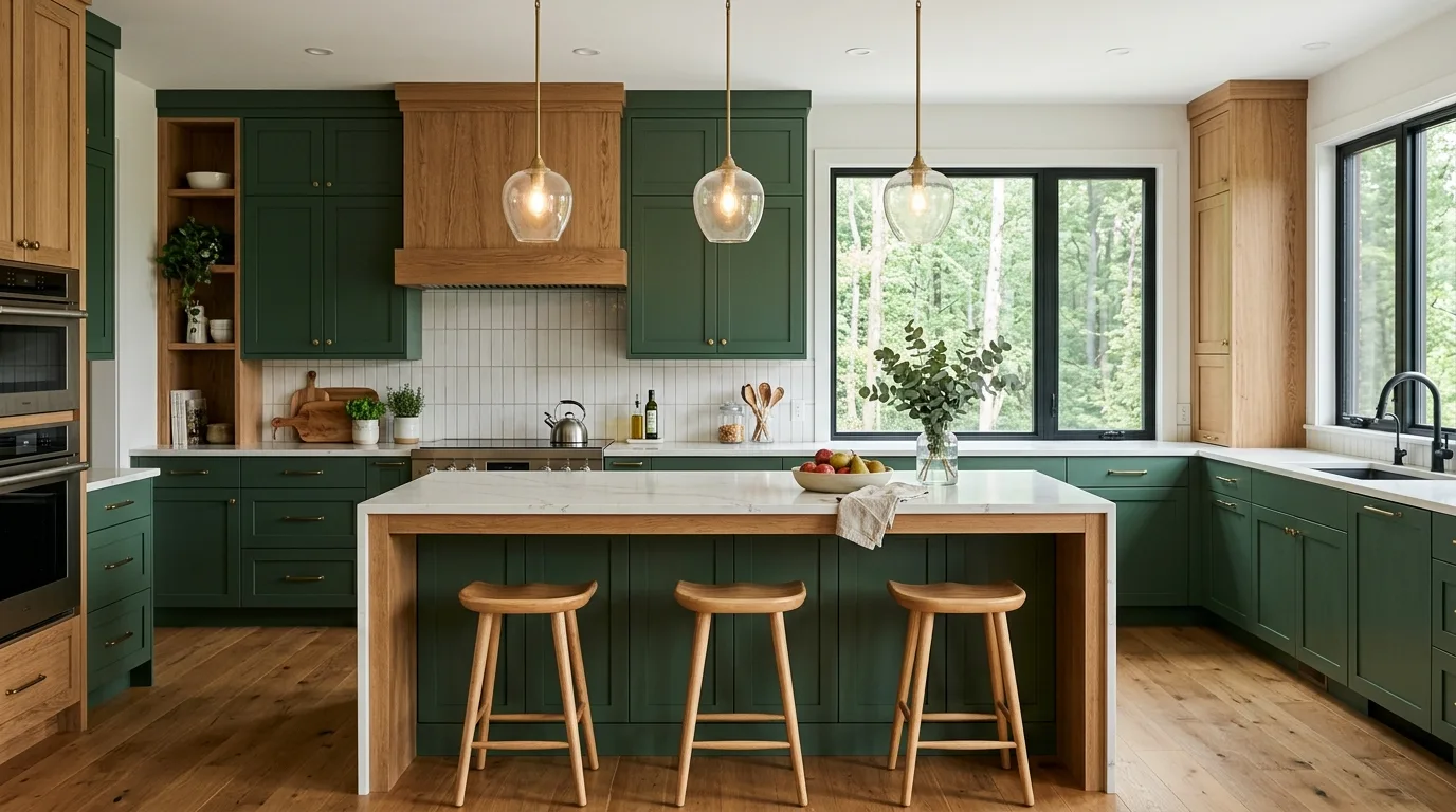
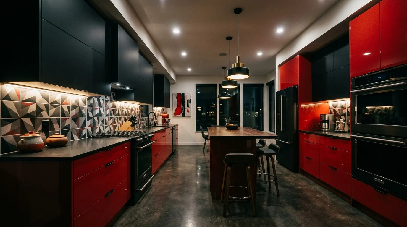
3. Use a Painted Island as the Accent Color
A painted island can be the perfect place to introduce a second cabinet color because it acts as a natural focal point. The rest of the cabinetry can stay quieter while the island brings personality.
This is ideal if you want contrast without committing every cabinet to a bolder tone. The room gets depth in a more flexible way.
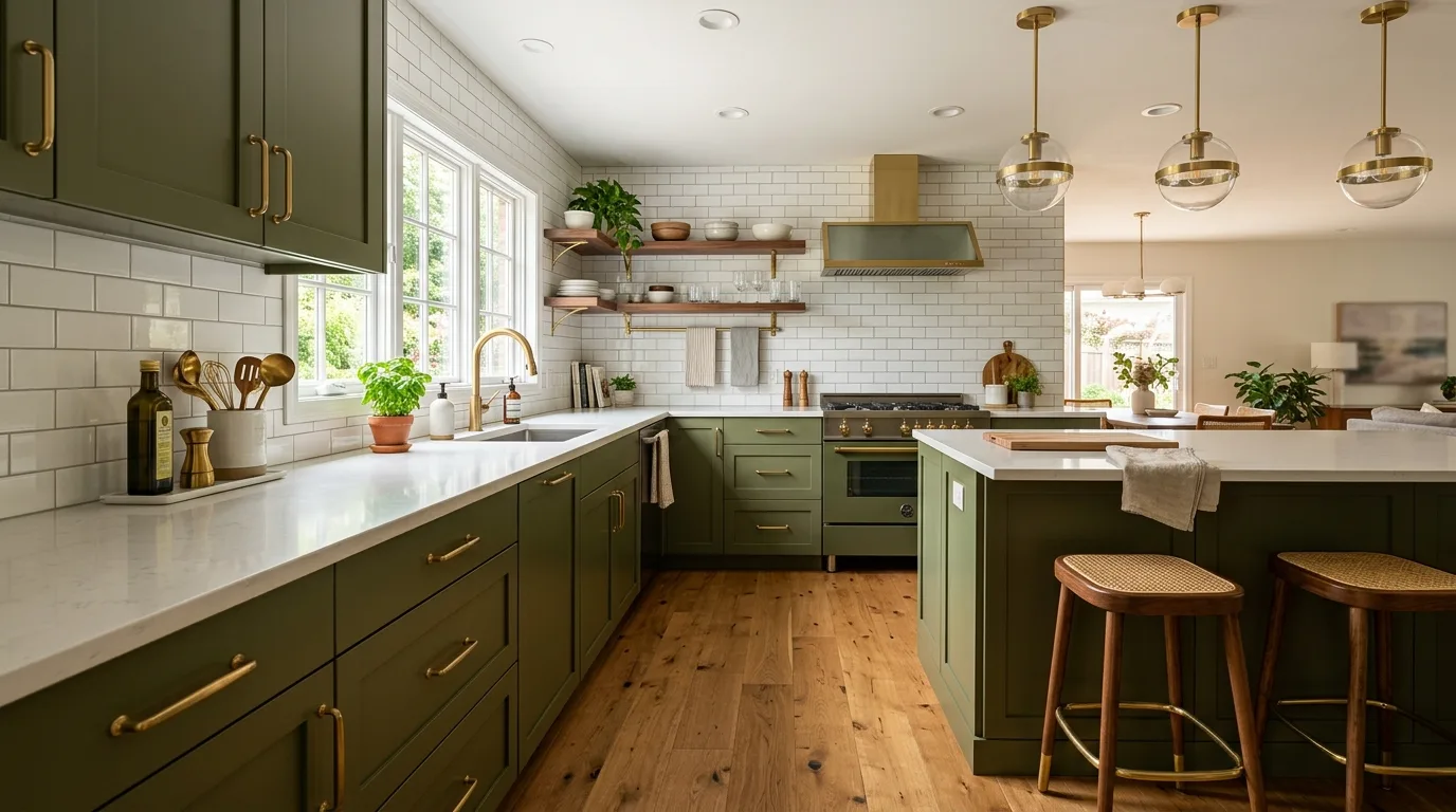
4. Mix Warm and Cool Tones Carefully
Warm and cool cabinet colors can work beautifully together, but they need a thoughtful bridge such as wood, stone, or metal finishes that make the pairing feel intentional. Without that connection, the kitchen can feel uncertain.
This is where material choice becomes just as important as paint color. A good bridge makes the whole palette make sense.
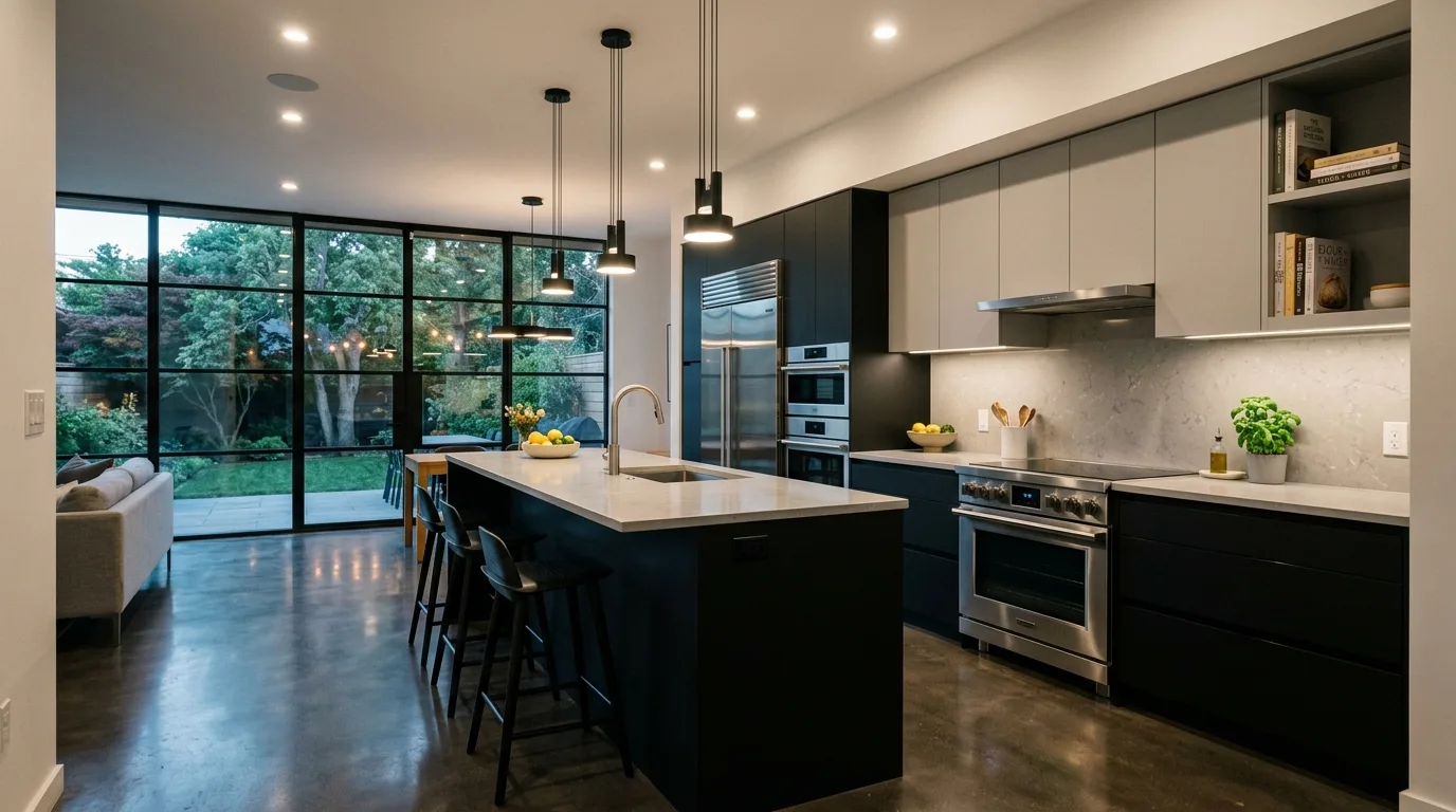
5. Use Contrast to Add Depth, Not Chaos
A strong cabinet pairing should add depth to the room rather than make it feel visually noisy. The most successful combinations have a clear relationship and enough simplicity around them to stay readable.
This is why two-tone kitchens often look best with restrained counters and backsplashes. Contrast needs a little quiet to land well.
6. Repeat the Accent Tone Elsewhere
Repeating an accent cabinet color somewhere else in the room can make the whole combination feel more cohesive. A stool, light fixture, or decorative detail in a related tone can subtly tie the kitchen together.
This repetition gives the palette rhythm. It helps the eye understand the design more easily.
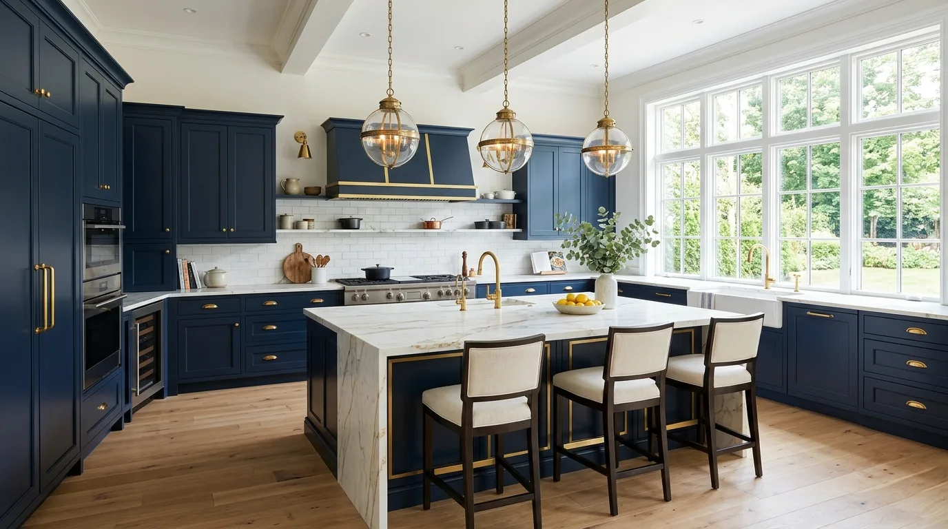
7. Let Material and Color Work Together
Color combinations feel stronger when they work alongside the grain of wood, the pattern of stone, and the finish of metal rather than in isolation. The room becomes richer because every choice supports the same overall direction.
This is what makes a color combination feel designerly instead of random. The palette belongs to the whole kitchen, not just the cabinets.
8. Keep the Overall Palette Edited
Once the kitchen already has two cabinet tones, the rest of the palette usually benefits from being more edited. Too many additional colors can quickly reduce the clarity of the design.
This does not mean the room has to feel plain. It simply means the cabinet pairing deserves enough breathing room to shine.
9. Create a Kitchen That Feels Layered and Smart
The best cabinet color combinations make a kitchen feel layered because they introduce contrast and structure without sacrificing harmony. With the right balance of tone, repetition, and restraint, the whole room becomes more interesting and more coherent.
Rooted in creativity and guided by style, The Garden Blueprint is your go-to destination for turning houses into warm, welcoming homes one thoughtful detail at a time. That same thinking shapes these cabinet pairings, creating kitchens that feel smart, layered, and beautifully balanced.